Rod Building Need Opinion on Wrap Color

Divad

Whitefish
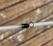
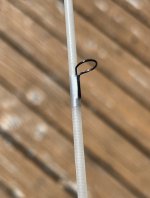
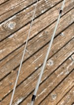
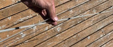
I cannot seem to decide on wrap style, to the point I’ve wrapped each section differently πŸ€¦β€β™‚οΈ

Color matching, semi translucent β€˜invisible’ wraps OR a contrasting black scheme? Or maybe some combination I don’t see?

Having the equivalent of writers block, I’m stumped on direction. Need opinions.
78FF95B2-9987-4A46-9A66-0BA9721B90F4.jpeg
5DB9ACAF-401A-499D-83B8-C74F215D420D.jpeg
B6CBD762-B395-4A9B-A384-100F9D12411A.jpeg
FD5540B1-AB39-4877-9C07-FD38FA43E734.jpeg
 
I think a light contrast to the blank color usually looks best. But you're in highly subjective territory.
 
I'm in the matchy-matchy camp, especially on a lighter colored blank. But the black/silver looks good, too.

Flip a coin, and if you're disappointed in the result of the coin toss, there's your decision.
 
I wrapped a similar colored glass rod with yellow/gold thread. It’s ugly. Besides my wraps are awful compared to yours. I like the black n silver
 
Search for β€œcolor theory” on Goog. Specifically, color schemes; complementary, triad, monochromatic, etc.

What colors look good together is a very well understood science and it can be applied to any such decision (art, furniture, etc).
 
@mcswny it’s an NFC Iconoglass in Natural - 7.5ft 4wt. Black titanium hardware, modified full wells and a little fighting butt.

I think if it was chrome hardware the invisible wraps would be an easier decision. The black guides seem to need a dark wrap to help make it look at home on the light blank.
 
Last edited:
Those black wraps with silver tips look great, nice straight wraps. Single foot quides.? Welcome to the dark side..
 
At first glance, the thin silver wraps in the black look like gaps to me. On a natural blank, I'd probably not fancy up the wraps. I do like the contrast, but with the dark guides the color match wraps look pretty space-age.
 
Back
Top