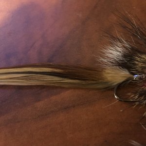
Rod Building Need Opinion on Wrap Color

Divad

Whitefish
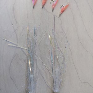
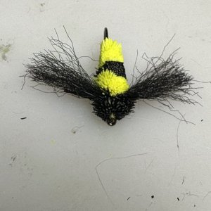
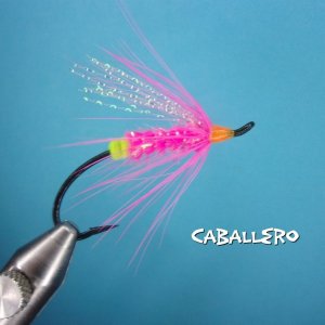
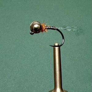
I cannot seem to decide on wrap style, to the point I’ve wrapped each section differently 🤦‍♂️

Color matching, semi translucent ‘invisible’ wraps OR a contrasting black scheme? Or maybe some combination I don’t see?

Having the equivalent of writers block, I’m stumped on direction. Need opinions.

78FF95B2-9987-4A46-9A66-0BA9721B90F4.jpeg
5DB9ACAF-401A-499D-83B8-C74F215D420D.jpeg
B6CBD762-B395-4A9B-A384-100F9D12411A.jpeg
FD5540B1-AB39-4877-9C07-FD38FA43E734.jpeg
 

Zak

Legend
Forum Supporter

Salmo_g

Legend
Forum Supporter
I think a light contrast to the blank color usually looks best. But you're in highly subjective territory.
 

PhilR

IDK Man
Forum Supporter
I'm in the matchy-matchy camp, especially on a lighter colored blank. But the black/silver looks good, too.

Flip a coin, and if you're disappointed in the result of the coin toss, there's your decision.
 

Buzzy

I prefer to call them strike indicators.
Forum Supporter
I wrapped a similar colored glass rod with yellow/gold thread. It’s ugly. Besides my wraps are awful compared to yours. I like the black n silver
 

jaredoconnor

Peabrain Chub
Forum Supporter
Search for “color theory” on Goog. Specifically, color schemes; complementary, triad, monochromatic, etc.

What colors look good together is a very well understood science and it can be applied to any such decision (art, furniture, etc).
 

Rob Allen

Life of the Party
Just my opinion, I don't like visible guide feet
I vote black
 

Divad

Whitefish
@mcswny it’s an NFC Iconoglass in Natural - 7.5ft 4wt. Black titanium hardware, modified full wells and a little fighting butt.

I think if it was chrome hardware the invisible wraps would be an easier decision. The black guides seem to need a dark wrap to help make it look at home on the light blank.
 
Last edited:

Wetswinger

Go Deep
Forum Supporter
Those black wraps with silver tips look great, nice straight wraps. Single foot quides.? Welcome to the dark side..
 

Guy Gregory

Semi-retired
Forum Supporter
At first glance, the thin silver wraps in the black look like gaps to me. On a natural blank, I'd probably not fancy up the wraps. I do like the contrast, but with the dark guides the color match wraps look pretty space-age.
 
Top